Beautiful Stone Surface Colors for Your Kitchen
by Rachel Lyon, Editorial Director for Direct from the Designers™
Are you looking for some kitchen inspiration? You can’t go wrong with the beauty of natural stone! Whether you’re looking for countertop or backsplash ideas, here are some amazing looks for kitchens of all kinds.
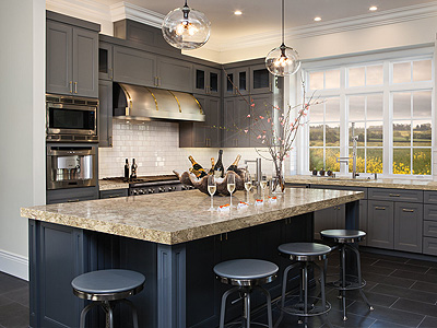
Earthy tones are great if you have a traditional house—think a little woodland cottage or European country home. Creams and light golden browns adapt fairly easily and look great with deep natural wood cabinets, while darker hues are starker and require careful balancing with other kitchen features.
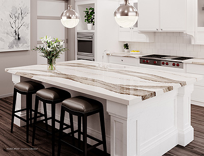
If solid/base earth tones aren’t your style, keep it bright and fresh by finding stone that offers brown as an accent. It’s the best of both worlds and simple to match, but make sure to consider the different brown colors in the room. Somebody with a walnut hardwood floor would probably want touches of a richer and deeper hue than somebody with maple, for example.
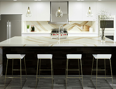
If you’re going for a light and warm look, consider marble with a white or near-white base and sandy or golden veining. This aesthetic is perfect for bright Mediterranean designs. It’s also great to add a warm pop to an otherwise plain or bold black and/or white kitchen.
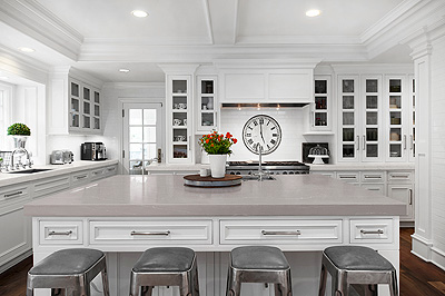
On the flip side, you can also add warmth with a base color. Look for subdued tones unless you really want a statement design! Most grays you see are cool, but warm versions exist, and they typically come in shades of mauve. They work great in bright modern and traditional designs alike!
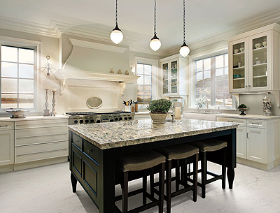
Most stone tends toward neutral colors—gray, brown, tan—but you can find a few stronger colors in the mix. If you want an earthy look with more oomph, consider green to provide a lusher appearance. If gray is too plain, a touch of blue could make your countertops cooler. Are you a passionate chef and like a bold look? Look to red to liven things up. You can let color theory be your guide to set the right tone.
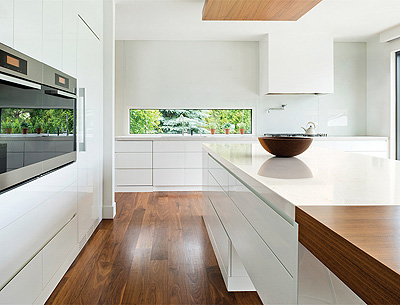
Perhaps you’re on the lookout for something really simple to match a minimalist contemporary design? Pure solid-colored stone is rare in nature, but there are options that look solid from a distance. Match their subtle tones to your design to make sure your counters blend rather than attract attention for the wrong reasons, and then appreciate their finer details up close.
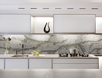
High-contrast stone options that have fairly even amounts of different colors—as opposed to solid colors with veining—are a sure-fire way to create a unique kitchen design. Saturated colors can come off very strong, but grays and subdued hues are usually safe. You can also consider contrast with different levels of shimmer to raise the design stakes.
The examples shown here are from Cambria®, a family-owned company that produces outstanding American-made quartz slabs. Check out the huge variety of options with their digital Design Palette and imagine what you could do in your own kitchen!
BROWSE HOME PRODUCT ARTICLES
- Creating a Spa-Like Master Bathroom »
- Designing a Water-Efficient Bathroom »
- Design a Modern Bathroom »
- View All Bathroom Articles »
- Building a New Home »
- Building a Duplex »
- Finding the Right Home Builder »
- View All Building Tips Articles »
- Adding the Right Columns»
- Decorative Touches for Your Interior»
- Shutters for Every Architectural Style »
- View All Columns & Millwork Articles »
- How to Use Specialty Laminates »
- Decorative Touches for Your Home's Interior
- View All Countertops and Surfaces Articles »
- What Goes Into a Great Deck? »
- Decorative Touches for Your Home's Interior »
- View All Decking Articles »
- Choosing Glass for Your Entry »
- Stylish Personas for Your Front Door »
- Using Sidelites and Transoms »
- View All Door Articles »
- Choose Siding for Your Region »
- Get the Most Out of Exterior Paint »
- Mixing Siding to Define Your Exterior »
- View All Exterior Articles »
- Finding the Right Home Builder »
- The Appeal of Small House Plans »
- Choosing the Perfect Floor Plan »
- View All Finding a Home Plan Articles »
- Colorful Flooring for Your Home »
- Designing With Different Widths»
- Chic, Neutral, Gray Flooring »
- View All Flooring Articles »
- Garage Doors That Add Curb Appeal »
- Caring for Your Garage Doors »
- Benefits of Insulated Garage Doors »
- View All Garage Door Articles »
- Reclaimed Products for Your Home »
- Building a Green and Stylish Home »
- Benefits of Building with SIPS »
- View All Green Building Articles »
- Cool Gadgets for Your New Home »
- Creating a Hi-Tech Home »
- Efficient Gifts for New Homeowners »
- View All Home Electronics Articles »
- Improve Your Home's Air Circulation »
- How to Improve the Air Circulation in Your Home »
- View All HVAC Articles »
- Bedrooms Designed for Sleep »
- Selecting a Fireplace for Your Home »
- Crafting a Luxurious Master Suite »
- View All Interior Design Articles »
- Design the Perfect Outdoor Space »
- Dive into a Beautiful Pool »
- Design a Sizzling Outdoor Kitchen »
- View All Outdoor Living Articles »
- Apps to Help You Pick Paint Colors »
- Create the Perfect Mood with Paint »
- How to Read the Color Wheel »
- View All Painting & Decorating Articles»
- Creating a Spa-Like Master Bathroom »
- High-Impact Kitchen Upgrades »
- Creating a Water Efficient Bathroom »
- View All Plumbing Fixtures Articles»
- Cladding That Complements Your Exterior »
- Reasons to Consider Prefinished Siding »
- View All Siding & Cladding Articles»
- All About Solar Powered Skylights »
- Natural Lighting for the Dark Corners of Your Home »
- Design a Better Bedroom with Skylights »
- View All Skylight Articles»
